Monday, 1 October 2012

PEARLS AND WATERMELONS

I'm back at uni for the 2nd year now and back with the girls in our little flat. The night before we started back, I thought I'd do a spot of nail art on Chhimmi and Sabrina. Nothing extravagant, but still quite sweet!

CHHIMMI'S NAILS: 
(1) Apply a few coats of jet black nail varnish for an even/thick coat.
(2) Once the nail varnish has dried, Cut the pink striping tape to size and apply finger-by-finger, applying consistently on one side of the nail.
(3) Apply nail glue next to the striping tape and apply two pearl effect gems one above the other.
(4) Once the glue has dried, apply a top coat.


SABRINA'S NAILS:
(1) Apply a few coats of emerald green nail varnish for an even/thick coat.
(2) Whilst the nail varnish is drying, cut 10 VERY thin slices from the watermelon fimo rod. 
(3) Once the varnish is dry, apply nail glue to the tips of the nails and apply the fimo slices with the watermelon pointing towards the cuticles. 
(4) Cut the bronze striping tape to size and apply finger-by-finger, applying consistently right below the point of the watermelon.
(5) Apply nail glue to the center of the striping tape and apply a diamonte gem - repeat on each nail.
(6) Once the glue has dried apply a top coat.

BEWARE:
Don't slice your fingers open when cutting fimo rods - it REALLY hurts & bleeds a LOT! 

Sunday, 30 September 2012

PURE LONDON - AUG 2012

I had the wonderful opportunity to work backstage as a dresser at Pure London again this August - it's the UK's leading fashion trading event and the place to be for existing and up and coming fashion brands. It's fantastic to witness this season's new collections from brands old and new, especially in action on the runway. The event sources hundreds of womenswear, young fashion, footwear, accessory, childrenswear and ethical fashion brands, with a HUGE range in different styles. As the number of dressers was slightly higher this year, we only dressed two of the four shows this time around, and dressing 4 shows a day gave us a little more time to admire what the event had to offer.


Above are some shots I took around the venue - Kensington Olympia. At a higher level you could really take in how huge the event really was, and that was only part of one section! (LARGE LEFT). Here are also some shots around the stalls, a sweet little cafe with lovely striped garden chairs and garden gnome stalls. The 'fabulous' bar and a shot of a season trend talk on the young fashion catwalk stage.


Above are photographs of some accessory stalls on the upper floor of the venue. The first and largest image is of some beautiful pieces from the collection by Pearls and Girls. The lovely handbag stall accompanied by a chandelier belonged to brand Juno, and the very cute, gold encrusted handbag and purse stall belonged to the brand Lie Down I Think I Love You.


  Above are some more accessory stalls. On the left is a lovely lady from the Vivien Sheriff stall sporting an incredible fascinator from their wonderful hat and fascinator collection. The photograph in the top right is a shot of the completely beautiful stall decoration at Disaster, and below are the simple yet OH-so-chic touches at the Orelia stall - I especially loved the vintage bottles used to display some of their lovely necklaces.


Above are new collection shoes from Bourne England, Iron Fist & Supertrash (LEFT TO RIGHT).


 Stalls from brands Darling, Mat De Misaine, Sebastian Ellrich and Supertrash (ABOVE).
I particularly liked how chic the Darling stall was with the floral china, and how bold the Supertrash stall was.


Stalls from Uttam Boutique, Emmy, Kat Von D - Los Angeles & Fever (ABOVE).
I'm a complete lover of 1940/50's fashion and fell in love with pieces in Emmy's collection. I also had a soft spot for the more alternative fashion pieces in Kat Von D's collection.


I absolutely loved the ladies on the Poppy stall, they were oh so lovely and
 their collection was VERY sweet! - 19050's style with a twist.


The extravagant sheer and lace pieces are from brand Catwalk Collections
the very sweet check dress and friends from Cutie and the simple nautical collection from Nissa.


Here are some cheeky shots from clothes rails at various stalls. I wanted to show the variation in colour, texture, print and style throughout the show. Above are collections from Almatrichi, Caramelo, Daisy May, Forever Unique, Frau Blau, Kuccia, Kat Von D, Olimara, Part Two and Rino & Pelle as well as others.


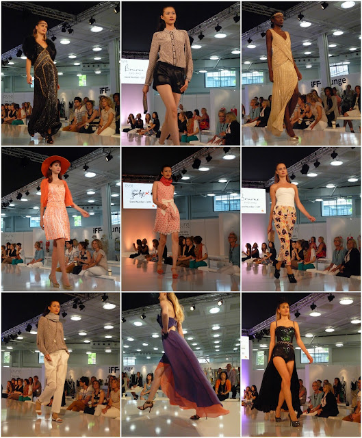
Above is a small selection of photographs I took at the Womenswear catwalk show, showcasing collections from brands such as Bourne England, Derhy, Catwalk Collections, Vivid Flair and Sarah Pacini


 Above and below are some of the photographs I took backstage in the dressing room of the Young Fashion (Spirit) catwalk where I was dressing. ABOVE- in the photo on the top left are the shoes my lovely model, Bruna Miranda used in the Spirit shows, and in the bottom right are a snap of some of the clothes on her rail. Dotted around are some photos of the models, all of which were absolutely lovely. The fantastic choreographer, Oke, (TOP RIGHT) really knew what he was doing and one of the coolest guys ever. 
Above are a few shots of my Brazillian model Bruna Miranda with Kat Nemcova, the Slovakian beauty with a real talent. Both girls were absolutely lovely and SO gorgeous! There are also some photos in the dressing room in and out of showtime. In the bottom left are the incredible Jeffrey Campbell platforms that were paired up with my Kat Von D look. 

I worked with items from brands such as Iron Fist, Kat Von D - Los Angeles, Forever Unique, AngelEye, Little Mistress, Glamorous, Danity and Influence

I really enjoy working backstage- you get to dress with some beautiful clothes, work with some gorgeous models and meet some lovely people. It's very exciting working behind the scenes in the hustle and bustle of a fashion show! Such a wonderful experience. 
(ABOVE)We managed to grab a quick glance of our girls on the catwalk during the final walk on 
the last show of the last day - it was a weirdly proud moment and a lovely end to Pure August 2012.


Tuesday, 25 September 2012

SAID BETTER IN RED


Everybody loves trying out new cosmetics, whether it’s nail varnish, eyeliner or false eyelashes, and being a curious individual with a passion for the 1940s and 1950s, I’m in love with red lipstick. Recently I have been hunting for a stunning dark red, burgundy like shade, but the task is proving to be more difficult than I’d originally thought to find that perfect colour. Whilst venturing around town , I popped into Poundland, the place for occasional necessities and rare gems, and fell upon a pack of three Sally Hansen cosmetics for the wonderful price of, you guessed it, £1. There were a fair few varieties of assorted products, but I was drawn to one pack in particular that included a gorgeous dark red lipstick. The pack consisted of  ‘Line Smoothing Mineral Lip Treatment’ in Rose Quartz, ‘Hard as Nails/Hard as Wraps’ nail varnish in Heartbeat Crème and ‘Colour Comfort Lip Colour’ lipstick in Sangria. For £1 it was only right to give it a go. I’ve used Sally Hansen nail varnishes before and they proved to be fairly long-lasting and come in beautiful shades, but never have I tried the lipsticks, which, to be completely honest on this occasion, I wasn't as impressed as I thought I would be. Despite the fact the colour was not as dark as I thought it would’ve been, it was still gorgeous. The lipstick itself was too moist and shiny and would soften and pale at the slightest touch, making it impossible to blot before using a lipstick sealant. Although the lipstick wasn’t very successful and long-lasting, I don’t regret buying the pack at all. There’s still the lip-gloss/lip treatment & nail varnish to test out, and the lipstick could still be used for future shoots. 

The search for the perfect red lipstick continues. 


PAYING HOMAGE TO MR. LYNCH

At the end of my very quick 1st year on my degree course, we were given 3 options to chose from for our final project/personal pathway review, I decided to focus my work on the wonderful Mr. David Lynch. As we had now veered off into pathways, I was now mainly heading down the photography and styling route in my work. For my projects final piece I took inspiration from scenes in short and full length films by the man himself. Although it was a fairly simple idea, I wanted to create a magazine spread that was paying homage and dedicated to Lynch

Although Vogue is an extremely well known and mainstream magazine, I have taken layout ideas from articles I have seen within it, as they have published features based on individuals within the art community and surrounding areas. I wanted to create a real likeness and feel for David Lynch's work within my photographs, and create the same visual effect found in the films that support my images from the styling to the emotional depth. 

My photographs have taken inspiration from 'Eraserhead' (1977), 'Wild at Heart' (1990), 'Blue Velvet' (1986), 'The Grandmother' (1970) and 'Dune' (1984). 


Sunday, 11 March 2012

LOVE TYPO

One of the projects during the imaging section of this first year on the degree course was to design a new typeface including uppercase & lowercase letters, numbers and punctuation. The brief specified we could use any graphic design program, 2D, 3D, and even edible materials. It had to represent something we are passionate about. To design my typeface I used letters, numbers and punctuation marks from the titles of films. For a long time I have been a huge lover of films from across the world from Japan to the United Kingdom. I’m into a variety of genres and types of films from horror to Disney and romance to action. Over time I have built up my film collection and whether they terrify me or make me cry, in my nature I am extremely curious and a daydreamer. I am very passionate about films and thought they might be perfect possessions to base my new typeface on, and turned out to be quite interesting, varied, bold and unique. I used letters, numbers and punctuation from throughout the titles not just the first characters as sometimes the most interesting letters weren’t the first. Once a film was used it wasn’t used again and only a few of the films I used were not my own. NOTE: Unfortunately, I had a little trouble finding films with some of the punctuation marks in and had to leave them out from my new typeface on purpose as I didn’t want to make them up and not use characters from a real film. In my research I gained knowledge of the different kinds of types used through the eras in film posters, I also found illustrations of type from Andy Smith and Ed Fella to be quite inspirational for my final typeface.
FILMS USED FOR UPPERCASE LETTERS.
FILMS USED FOR LOWERCASE LETTERS.
BELOW IS MY FINAL TYPEFACE, ALTHOUGH, I HAVE ONLY INCLUDED MY UPPER AND LOWERCASE TYPE.
I hand drew all of the characters and used a variety of materials. Although it took longer than i thought, I’m quite happy with the end results. They’re bold, charismatic and unique, and they represent something I’m really into and forever building on.

LIVE POSTER WORKSHOP

During the Imaging section of this first year at uni, we participated in a 2 day live poster workshop. The idea was to group up and create and replicate a film poster from any generation and genre. We all decided we wanted an old horror poster to work with and ended up choosing the 1958 film, “The Crawling Eye”. We liked the different elements within the poster and thought we could have a lot of fun with it. We all chipped in doing different jobs and used a variety of materials from cardboard to old pairs of tights stuffed with newspaper. We wanted the end result to look “terribly good” and I think we achieved that. We did leave out a few minor details though, as they wouldn't show up in the end photos. It was actually quite an interesting and fun experience and something I've not done before. It was nice working with people I hadn't worked with before and we had a lot of fun participating in the workshop. We also decided to use our only male group member as the main female character, as we thought it would add to our fantastic mess. We all got involved in holding up the scenery and being in the photograph, we wanted it to be very obvious that it was all being held up and together.

These are a few photos I took of us hard at work. We worked really well together and got everything done in time. It was quite nice to be able to get back to basics and have some good old fun with paint.
These are our final images. We wanted to include a lot of group participation and get everybody from our group into the photos. The end result was terribly good.

Saturday, 10 March 2012

LONDON FASHION WEEK - February 18th 2012

A couple of friends and myself headed up to London Fashion Week on the Saturday, it was rather busy and our attempts to get into some shows in the Courtyard didn't go to plan as they were completely full up. It was a bit of a disappointment, especially with the torrential rain, which also meant that I didn't get as many street style photos as I would have liked but it was a nice day anyway. Got snapped a few times by various photographers/bloggers which was a surprise but very flattering! There were some GORGEOUSLY dressed people at the event, shame about the weather. Despite the lack of sunshine and entry into shows, it was a nice day and afterwards we ended up in a lovely Nepali restaurant - DELISH!!
COURTYARD, ADS & PEOPLE.
THE FASHION FILMS SHOWN ON THE SCREENS OUTSIDE THE COURTYARD WERE MESMERISING, ESPECIALLY IN THE DARK AND RAIN.
ENJOYING A LOVELY CUPPA AND A TREAT AT THE CAFE.

PURE LONDON - FEB 2012

I had the wonderful chance to work backstage as a dresser at Pure London 2012. The event takes place twice a year at Olympia London and is the UK's leading trade fashion event for sourcing hundreds of womenswear, young creative fashion, accessory and footwear brands. The event consisted of stalls and two catwalk stages that showed various shows all day, every day. The two stages showcased Womenswears, WGSN, Young Fashion & New Brands. It was a wonderful experience to be able to work in the hustle and bustle behind the scenes at a fashion show and to work with some wonderful new people, it was all very exciting! I was paired with the wonderful Irish model, Caitlyn Leckey, she was lovely to work with, absolutely gorgeous and such a nice girl. I had the chance to style with items from Iron Fist, New Rock and Kat Von D's new collection. It really was a wonderful experience and I enjoyed every minute of it. Here are some photos I took on my Blackberry of and around the event.
THE VENUE - PART OF IT AT LEAST! THE PLACE WAS ABSOLUTELY HUGE.
ONE OF THE CATWALK STAGES WITH VIEWERS AT THE READY.

CHECKING OUT THE MANY STALLS.
WANDERING AROUND.
AN IPHONE LIKE APP/SCREEN WHERE THE USER CAN ACCESS A DATABASE OF THE EVENT, FROM STALLS TO CATWALK TIMES.
CHHIMMI AND I GETTING OUR STEAM ON.
A CHEEKY PEAK AT THE GARMENTS AND GOODIES BACKSTAGE AT THE WOMENSWEAR AND WGSN CATWALK.
DRESSING ROOM FOR THE NEW BRANDS AND YOUNG FASHION CATWALK.
MODELS PRE-WALK LINE-UP.
I HAD THE CHANCE TO MEET THE WONDERFUL KAT VON D AT HER STALL, NOT ONLY IS SHE AN INCREDIBLE TATTOOIST, SHE'S ALSO A LOVELY PERSON WITH A KEEN EYE FOR FASHION AND DESIGN. UNFORTUNATELY, I LOOKED AWFUL ALL THROUGHOUT THE 4 DAYS SO I LOOKED EVEN WORSE STANDING NEXT TO THE GORGEOUS MISS VON D. I ALSO MET LAUREN POPE FROM TV'S 'THE ONLY WAY IS ESSEX' BUT I LOOKED EVEN  MORE TERRIBLE IN THAT PHOTO SO WASN'T GOING TO DISPLAY THAT ONE!
LEFT & RIGHT: A FEW OF THE MODELS BEFORE ONE OF THE NEW BRANDS AND YOUNG FASHION SHOWS. CENTRE: A COUPLE OF THE MUAs AND HAIR STYLISTS.
ME AND MY LOVELY MODEL, MISS CAITLYN LECKEY.